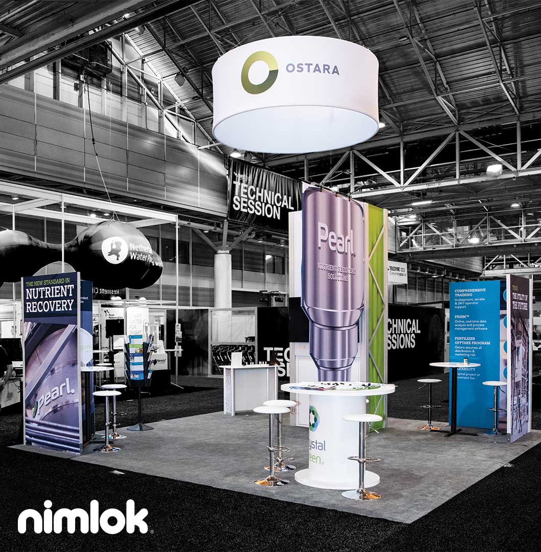
On average, an exhibitor has three seconds to communicate key brand messages to passersby on the trade show floor. This short timeframe makes having attention-grabbing trade show graphics a must.
In this post, we cover several important areas to creating memorable and attention-grabbing trade show booth graphics to help you exhibit better at your next trade show.
Jump to Section
Brand Personality
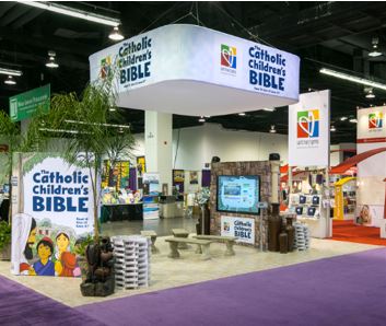
While attending a trade show, it is important to showcase your brand’s personality. For example if you had something like Custom Koozies on display to get your brand name out there, it could be a good idea to offer these items in things like goody bags or just have them on display so it gets people talking about your business. You can also use something like a spectrum lectern as a way to address your customers, there are also media friendly ones that can help you show demos to your customers, getting their attention as they walk by. A brand’s personality should signify human characteristics such as honesty, fairness, friendliness and commitment to customers.
When planning for your trade show, outline your target demographic and the value your brand’s personality can offer.
Once you have figured out your audience and your value proposition, you need to devise a way to communicate your brand’s personality visually via trade show graphics.
When designing graphics to match your brand’s personality, ask yourself the following questions:
- Is your brand outspoken or reserved?
- Does your brand embrace playfulness or are you more serious?
- Does your brand appeal to younger or older clientele?
- Is your brand considered masculine, feminine or gender neutral?
- Is your brand an innovator in your industry or are you more traditional?
- How can you use your brand colors and fonts to show off your personality?
- Do you consider your brand as having a formal or playful relationship with clients?
Your answers to these questions will dictate the colors, fonts, lighting and interactive elements you incorporate into your trade show graphics, so think carefully when examining your brand’s personality.
Placement of Trade Show Graphics
Purpose, size and legibility are all factors to consider when designing and placing of your graphics. To make trade show graphic design and layout easier, divide your graphics into three categories:
Long-Range Graphics
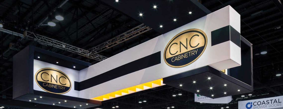
Long-range trade show graphics are graphics that can be viewed and understood from 100 feet away or further. These graphics are typically used for brand visibility and identification and feature your brand’s logo, mascot or signature product.
Long-range graphics for island or peninsula exhibits are usually placed on a hanging sign or tower.
For inline exhibits, long-range graphics can be placed on kiosks, backwall signs or canopies and should be displayed at the maximum height allowed by show management.
Mid-Range Graphics:

Mid-range trade show graphics are viewable 10-50 feet from the aisle. Mid-range graphics are most commonly signs and images used to further identify your company and its products and services. The intent of mid-range graphics is to lure attendees from neighboring exhibits or walking the aisles into your space.
Mid-range graphics are placed on the outer walls of an island or peninsula exhibit or featured on the backwall of an inline display. These graphics sholud bepositioned at or just above eye level, between 5-8 feet from the ground.
Short-Range Graphics:
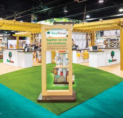
Short-range trade show graphics are meant to communicate your brand’s message once attendees are in your exhibit space. Short-range graphics include images and text legible only from close distances.
Copy typically includes products or company information as well as infographics, charts and graphs.
Short-range graphics are smaller than mid- and long-range graphics and are meant to be read from 1-10 feet away at eye level, between 5-6 feet from the ground.
Color is King
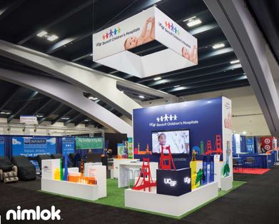
Color plays a critical role in trade show booth graphics because of its ability to establish the mood of a space. In fact, it can be argued that color—above all else—is the most important detail in trade show graphics.
Below, we cover the best practices for selecting the right colors for your trade show graphics.
Creating a Color Scheme
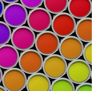
Your color scheme should reflect your brand and personality while complementing your messaging. Your color scheme should tell the world,“I am here. Come visit with me.” While your color scheme should be consistent with your overall marketing design, it should also be bright enough to stand out.
While selecting a color scheme for your trade show graphics, it is important to remember that the way attendees perceive colors heavily depends on the context in which they view them. This makes it extremely important for you to create a color scheme that is harmonious.
Color harmony is defined as an attractive arrangement of colors that are pleasing to the eye. If done right, color harmony will attract prospects and create a sense of visual order in your exhibit.
To create color harmony, match the colors you use for your graphic elements—such as fonts, text holders, images, shapes and borders—with the colors of your exhibit’s prominent structures and components.
Avoid using obnoxious colors for short-range graphics. However, do use them for long-range graphics to help draw attention to your trade show exhibit.
Be careful of too much color unity, which could lead to under-stimulation, as each design element will appear to meld together. Too much color diversity, however, leads to over-stimulation, so make sure you find the right equilibrium.
Color Psychology

Colors have an uncanny ability to effect emotion and mood. Vivid and lively colors can inspire verse and song, while drab and dull colors can dampen even the highest of spirits.
For example, fast food restaurants use red and yellow in order to create a sense of excitement, while hospitals and spas tend to use blues and greens, which are calming.
In the following chart we list the most popular colors and the associated emotions:
| Red is an intense and passionate color that grabs the attention of the viewer. |
|
| Purple is most often associated with creativity and luxury. In fact, the ancient Romans viewed purple as a regal color. |
|
| Blue is one of the most popular colors for brands and works well to put people at ease. |
|
| Green is earthy and symbolizes growth. Green also has a soothing effect on people. |
|
| Yellow produces a warming effect and arouses cheerfulness, energy and mental acuity. |
|
| Orange is a cross between red and yellow and invokes a sense of boldness and excitement. |
|
| Brown, like green, is an earthy and comforting color and denotes simplicity. |
|
| Black denotes power and authority and is a formal, elegant, and prestigious color. |
|
| White represents purity, cleanliness and new beginnings.
|
|
Composition is Key
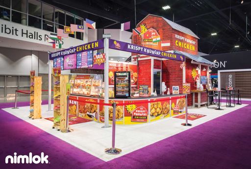
The composition of your trade show graphics should weave all the separate elements together to form a whole. All of your text, images and colors should come together to form one cohesive look and feel.
Below, we outline the best practices when it comes to mastering the composition of your trade show booth graphics.
Contrast:
Strong contrast in hue and value is essential for creating exceptional trade show graphics. Hue relates to the identity of a color and value measures a color’s brightness or darkness. Contrasting colors are for long-range graphics from a distances and can be used on hanging signs to great effect.
Graphics tell a story, it is important that your attendee has a proper beginning and end point, so that the full impact of the trade show graphics can be felt.
In the Western-world, people read left to right, so placing important images of information to the left and having the viewers eyes progress to the right will help ensure your message is getting across.
Make sure to emphasize logos, products, text and other design elements because they strongly communicate your brand and your value proposition.
Find a Focal Point

The key element to good trade show graphic composition is having a strong point of focus to help your visitors’ eyes naturally settle on important sections of your trade show exhibit.
When determining your focal point, remember that your main goal should be to communicate an idea, tell a specific story or to relay important information.
Hierarchy
Visual hierarchy is the organization of graphic elements to visually signal importance. More important elements, such as a logo, should be bigger, brighter and bolder than less important elements.
Imagery
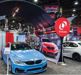
Technological advances in printing have allowed trade show exhibitors to use progressively complex imagery on their trade show booth graphics. However, the rules for effective trade show graphics have persisted: imagery should be bold, clear and easy to understand.
The images you choose for your trade show graphics should support your message and be powerful enough to communicate it, regardless of whether an attendee reads your marketing copy or not.
Many people are visual learners. If you have important data applicable to your business, use charts, graphs, infographics and illustrations to make more complex ideas easier to digest.
Tips for trade show booth graphic imagery:
- Bold images against simple backgrounds make for high-impact visuals
- When purchasing stock images, buy the biggest, highest resolution file available
- Use imagery of your product in action
- Use imagery of people rather than objects or scenery
The Importance of Lighting and Trade Show Booth Graphics
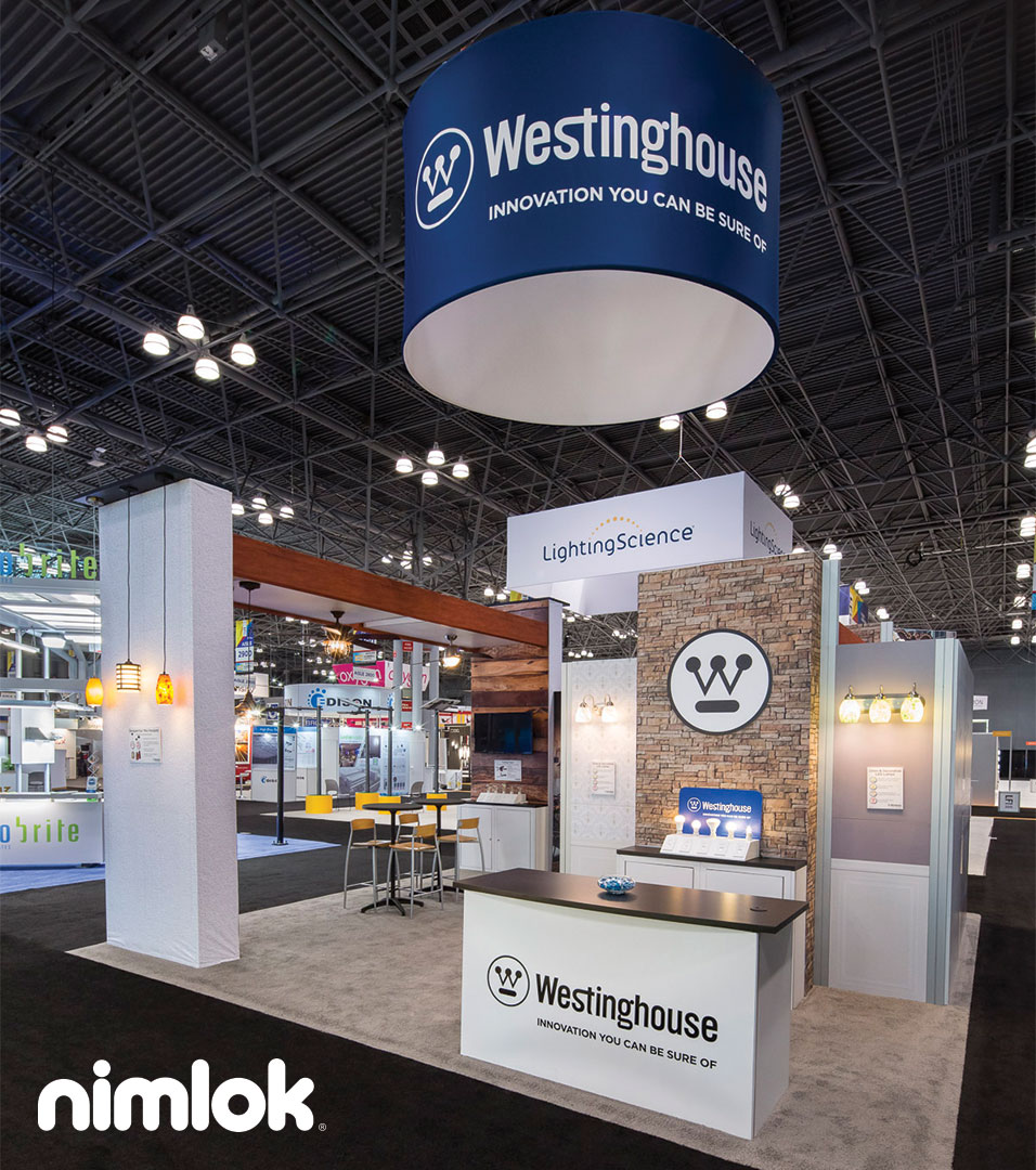
A well-lit trade show exhibit is essential, allowing visitors to easily read signs and promotional materials such as a line card to help promote your product and business. Proper lighting leads attendees toward the message your brand is trying to convey.
There is a diverse array of lighting options that can help make your graphics stand out on the trade show floor.
- Backlit laminate paneling can be effective in highlighting branded messaging while simultaneously illuminating the exhibit space
- Overhead lighting hanging or affixed to an exhibit can be used to brighten key areas
- Accent lighting can help bring out the details and textures of an exhibit
- You want lighting bright enough to draw attention without blinding attendees
Make sure your graphics are well-lit with quality trade show display lighting that enhances the imagery and messaging of your graphics.
The Importance of Messaging and Fonts in Trade Show Graphics
The best trade show booth graphics incorporate smart brand messaging bolstered by careful use of fonts and typefaces.
To get started, reference the rules of billboard readability, and try to keep your copy to ten words or less.
Copy containing more than ten words is less likely to be read, and trade show graphics that cannot be read in three seconds lose the attention of attendees.
Below we outline best practices when it comes to messaging and fonts for trade show graphics.
Messaging
Tone of Voice
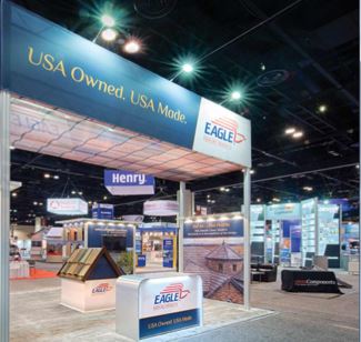
Before you draft your brand messages, you will need to set an engaging tone of voice. To perfect your tone of voice, refer back to your brand’s personality.
Are you going for more of a lighthearted and playful approach? Is your audience made up of executives, therefore necessitating a more serious tone?
Embracing a tone reflective of brand personality will align the message and supporting graphics to your goals and objectives.
Prospect-Centric Messaging
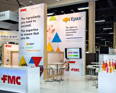
On the trade show floor, your primary job is to attract prospective clients to your booth, so your brand messaging needs to be prospect-centric.
Before deciding on your messaging, take time to do research on what your customers want, which pain points to target and what messaging resonates strongest with your target audience.
Competitive Messaging
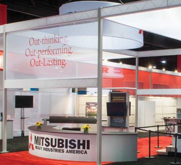
Trade shows are one of the few times your company will be face-to-face with your competitors and customers in the same venue.
When planning your trade show graphic messaging, consider your marketplace and keep in mind that your message should be unique to avoid potential buyers confusing your brand with a competitor’s.
Taglines and Catchphrases
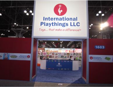
A good tagline or catchphrase will amuse and intrigue prospects, raising the chances an attendee will visit your booth on the show floor.
Like prospect-centric messaging, your tagline or catchphrase should be aimed toward the customer, but you must also indicate your brand’s vision and concisely convey what you do. It can be tough to find the right balance between addressing your prospect and promoting your brand, so be patient!
Elevator Pitch
If you have a smaller 10 x 10 trade show exhibit, you have less room for messaging, so you will need to condense your message. Brainstorm ways to describe your brand in 3-6 words. As an added bonus, this exercise can help you simplify your brand messaging in your overall marketing program.
Font and Typeface
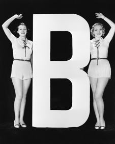
The font that you utilize for your trade show graphics has a huge impact on the way show attendees and booth visitors will interpret your brand messaging.
When selecting fonts for your trade show graphics, identify simple and easy to read lettering. Your audience’s eyes may find it difficult to read multiple typefaces, so stick to a simple collection of one to three fonts for maximum readability.
Font Tips:
- Use scale, shapes or compositional features for words that need emphasis
- Choose colors that correlate well with your typeface to increase readability
- Chose a typeface that melds well with copy (i.e. fonts with softer edges are friendly, hard-edged fonts are seen as strong)
- Apply a line, circle or box to call out copy or to anchor a block of text
- Leave a sufficient distance between letters to improve legibility for far distances
- Use a standard fonts, as unique fonts can be distracting
Material Matters
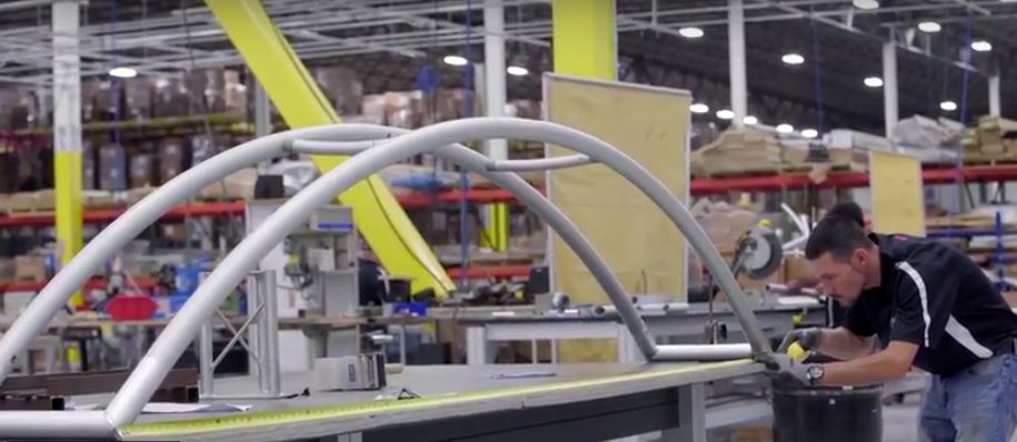
It is said that a painting is only as good as the canvass on which it was painted. The same is true for trade show graphics.
Fabric materials can capture the vivid details of your images and graphic elements. Tension fabrics, which are fabrics designed to stretch, are malleable and easily manipulated, offering greater flexibility in the creative direction your trade show graphics can take.
Laminate and vinyl materials produce a glossy, bright and sleek visual. Consider using these materials for use in promoting bold messages on short-range graphic elements in your booth.
No matter which materials you choose, make sure to pack and store your graphics with care. Sturdy packaging — such as shipping cases, crates, cartons, or protective tubes — is critical in protecting trade show graphics and can take abuse during shipping and storing between shows.
G7 Certification
While seeking a commercial printing partner, ask potential vendors if they are G7 certified. Printers with a G7 Certification maintain specific international standards and are able to deliver the utmost in quality as well as quick turnaround times.
What is a G7 Certification?
The G7 certification is the industry leader in commercial print requirements and ensures consistent reproduction of design and color across printing materials, regardless of the inks or substrates used.
G7 represents “Gray,” and the 7 primary and secondary ink values: Cyan, Magenta, Yellow, Black, Red, Green and Blue. G7 is the international standard for standardizing printing and print proofing systems.
A G7 certified printer should possess the following traits:
- Skilled, tested, certified and established to be a leader in commercial print production
- Knowledge of the fields of color management, process and quality control for proofing and printing materials
- Works to reduce costs, have quick turnaround time and improve production consistency
Updating Old Trade Show Graphics

Attending trade shows and industry conferences can get expensive. If your trade show exhibit has started to show wear and tear, you can save a lot of money by sprucing up the graphics instead of buying a brand new exhibit. If you need help designing large format graphics check out our post here.
New Graphics
For older exhibits, consider giving your exhibit a facelift with new graphics. New trade show graphics also present the perfect opportunity to test out new marketing messages or incorporate new design elements.
Reprint Graphics
A graphic reprint is a cost-effective way to instantly reinvigorate your trade show exhibit with lively colors and new, bright material. Many trade show exhibits are designed with graphic interchangeability in mind, making it an inexpensive way to give your trade show exhibit an immediate makeover.
Conclusion:
A trade show exhibit with stunning graphics will undoubtedly make a huge impact on the show floor and leave a memorable impression on attendees. Work closely with your exhibit partner to determine how to best present your products and services with creative graphics. To learn more trade show tips on ways to become a better exhibitor, download our free Beginner to Winner trade show e-book:


Thank you for this comprehensive discussion. I absolutely agree that your display should speak to the prospective customer about your brand, its message and its vision. The way to do so is through graphics. However, while choosing the colors and fonts, stay with only two or three colors and pick an easily legible font. Your aim is to get your message across not bombard the onlooker with too much to take in at the first glance.
My sister is a designer and loves to do trade show exhibits, and she’s always pointing out the importance of color. I like that you said that attendees perceive colors depending on the context, which should be in harmony with the color. I would think that color would be something at a trade show exhibit that draws people to your display.
Prob my favorite article I have read in a while
These are all excellent things to consider when designing your booth for a trade show. I like what you had to say about the lighting playing an important role in your potential visitor’s ability to read signs and promotional materials. If you take the time to get nice pamphlets and signage made, you probably want to show that off. This could be the difference between someone remembering your company and someone forgetting it.
I love that you take some time to remind your readers about how important an engaging tone of voice is. After all, when you’re at a trade show you are likely showing off some kind of product or service. If this is the case then you will want to make sure that your signage has an engaging tone of voice so that you can convince your visitors to try your product or service.